Michael Senkow
I Build Machines

meta, data-viz framework for infra and ai-infographics
Role: Product Designer
Entity: Meta
Location: Seattle but with talks in MPK, London and Tel-aviv
Years: 2022 – 2023
Team make-up: The focused team consisted of myself, a main front-end developer, a main PM, 5-8 engineers involved in training, additional engineers brought in for related work, and a researcher helping confirm the results.
Starting basis
At this point of my time at Meta, I had already seen partial implementation of the notebook merging work within our Daiquery/Bento teams and had been covering our Data explorer project for a while. Data-visualizations were a common aspect of both these products and a wide array of other tooling within the internal systems.
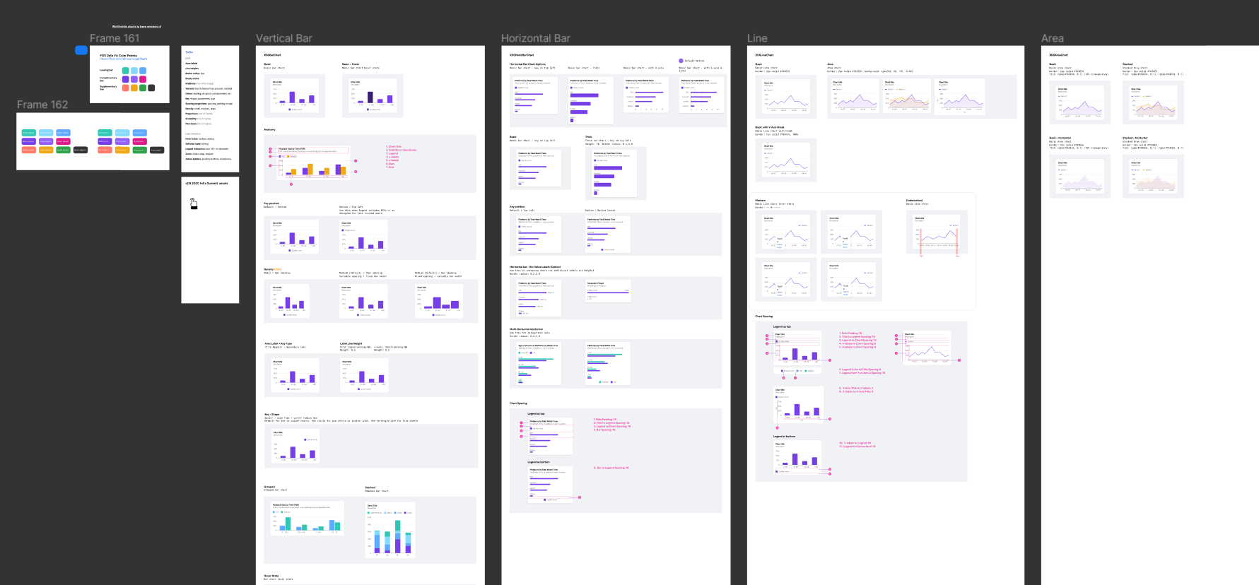
When I initially looked at this, we had some very basic Figma files that laid out examples of chart types but had not been fully implemented in code.
The existing designs looked nice but hadn’t been worked on with engineering and didn’t take into account basically any of the current restraints of Highcharts. Actual implementation was near non-existent and axises, typography, basic colors were almost universally inaccurate across tooling.
Research sessions across the other analytics spaces often brought up the desire from our users for a wider range of options and the ability to use charts to better tell stories. It was an odd conversation at times to weed through, because there was the marked desire for people to still have control over
Approaching the problem from an atomic perspective


I approached this problem from two directions. Overseeing the workplace group around infra Data-viz was part of this, and answering immediate weekly / monthly interaction needs that improved different engineering flows was happening in concurrence with trying to organize this area better.
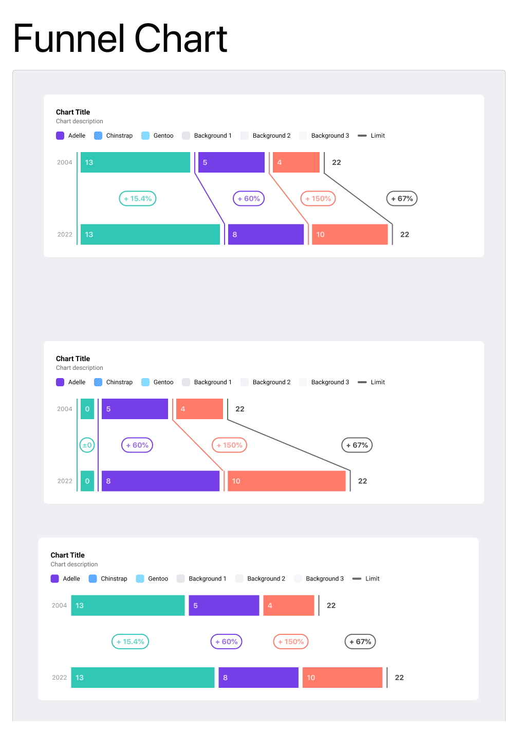
I started laying out more of an atomic / pattern based system of how charts would be approached, alongside creating the examples of the chart types various leads were planning for implementation into their products. While we had basic bar charts there was the desire to expand that and have things like:
Slope charts
Parallel coordinates
Barbell charts
Network diagrams
Funnel charts
Sankey diagrams
and more…
By laying out designs and going into the discussions looking at this as more of a component based system that could grow into a range of different chart types, it opened up conversations on how we were approaching this technically. The highcharts library that powered most of the charts at the company simply was hard to deal with and actually styling / properly implementing it often ran into friction and points where, in Meta’s move fast system, results often missed the intended goals.


Connecting with engineering via Vega and sharing out the results of the work
For connecting the results of this work to a wider audience I connected with XFN in a number of directions.
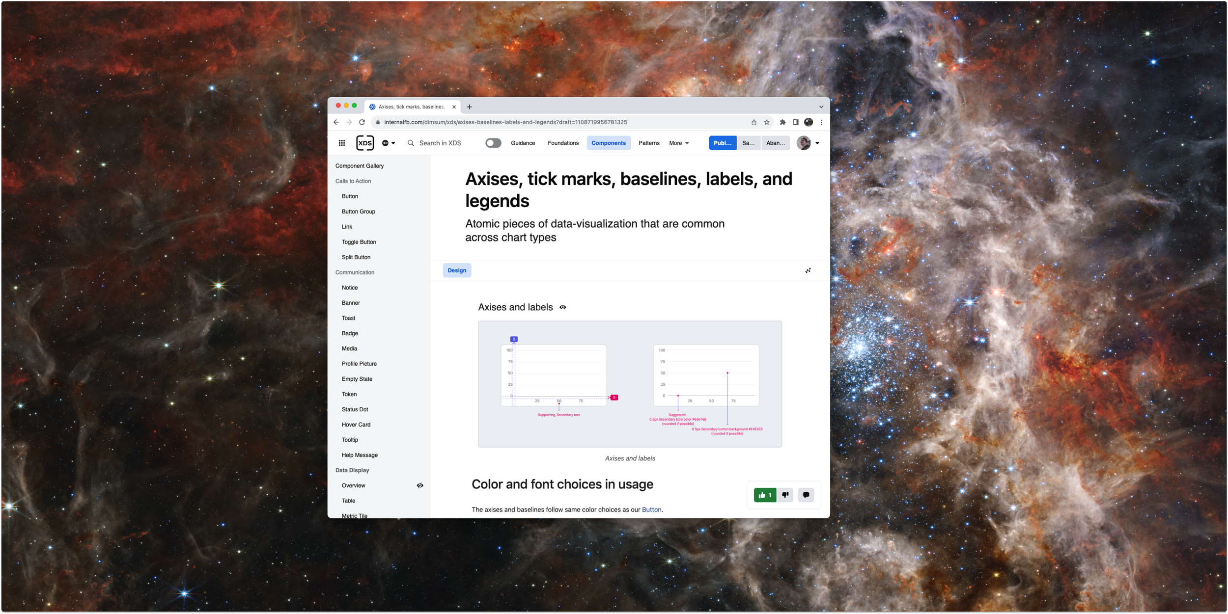
Examples and guidance were posted to our Dimsum to spread awareness and information on what components existed and how to implement and use them.
Coded Vega examples were made and a library of these different chart types based on this system began to be produced. Some of this work was training engineers on how the config file worked with Vega for changing visual nuances.
These steps were shared out to the Workplace groups where users cared most and input on changes that still needed to occur or desired features for the future were added.
A big thing that kept reoccuring was the desire for a wider range of color options. The existing XDS color palette wasn’t color-blind compliant and didn’t take into account the range of additional specific needs data-viz had (categorical types, specific needs on contrast.
That grew into a short project connected to this work.


Expanding the Data-viz color options
I was juggling a lot of projects at the time, including this one, additional requests around notebooks and AI workflows, and the ongoing need for a better spectrum of colors.
The lack of a better spectrum color issue kept coming back to be a pain in our design goals. I connected with designers in EPS who had more specific needs for their product space and together we quickly produced a set of colors that hit both our technical needs for the system and their specific use-case needs.
This process unto itself was a mixture of deep research, confirmation with our users, and extensive testing across both the designed and coded versions of the charts being produced.


Some Blue-sky next steps concepts involving AI
Near the end of this work-area, there was a mini-hackathon that let me explore the future potentials for data-viz, and the Engineering side I was focusing on with this workflow started looking into the potential for natural language for direct chart creation.
I came up with a process of using the svg shapes from data-visualizations in conjunction with control-net processes with AI-image generation tooling like Stable diffusion, to create accurate and precise infographics.
The work on the config aspects of Vega also seemed to be connecting nicely into a number of conversations for how this could be used to highlight pieces of a dashboard or to produce ultra-specific chart-types based on user prompts.
Determination of success
Was this a success? Yes! How did we measure this success?
Broadly (and I don’t good images of this) any of the component chart types produced were tracked and we had consistently growing usage of the charting update.
The types of chart being used across dashboards was increasing. By expanding the ecosystem of charting options users could better display their intentions when solving other company problems with metrics.
Anecdotally (part of the infra design process were continuous research decisions) people simply responded well. There are key aesthetic points in the charts that connected with XDS.
The AI-Infographic concept won some prizes at a hackathon and spurred a lot of conversation of potential, if farther future potential.
The LLM/natural language workflows started to get picked up and discussed as part of halfs work.
Full deck of AI-imagen concept with better explanation to left.