Michael Senkow
I Build Machines

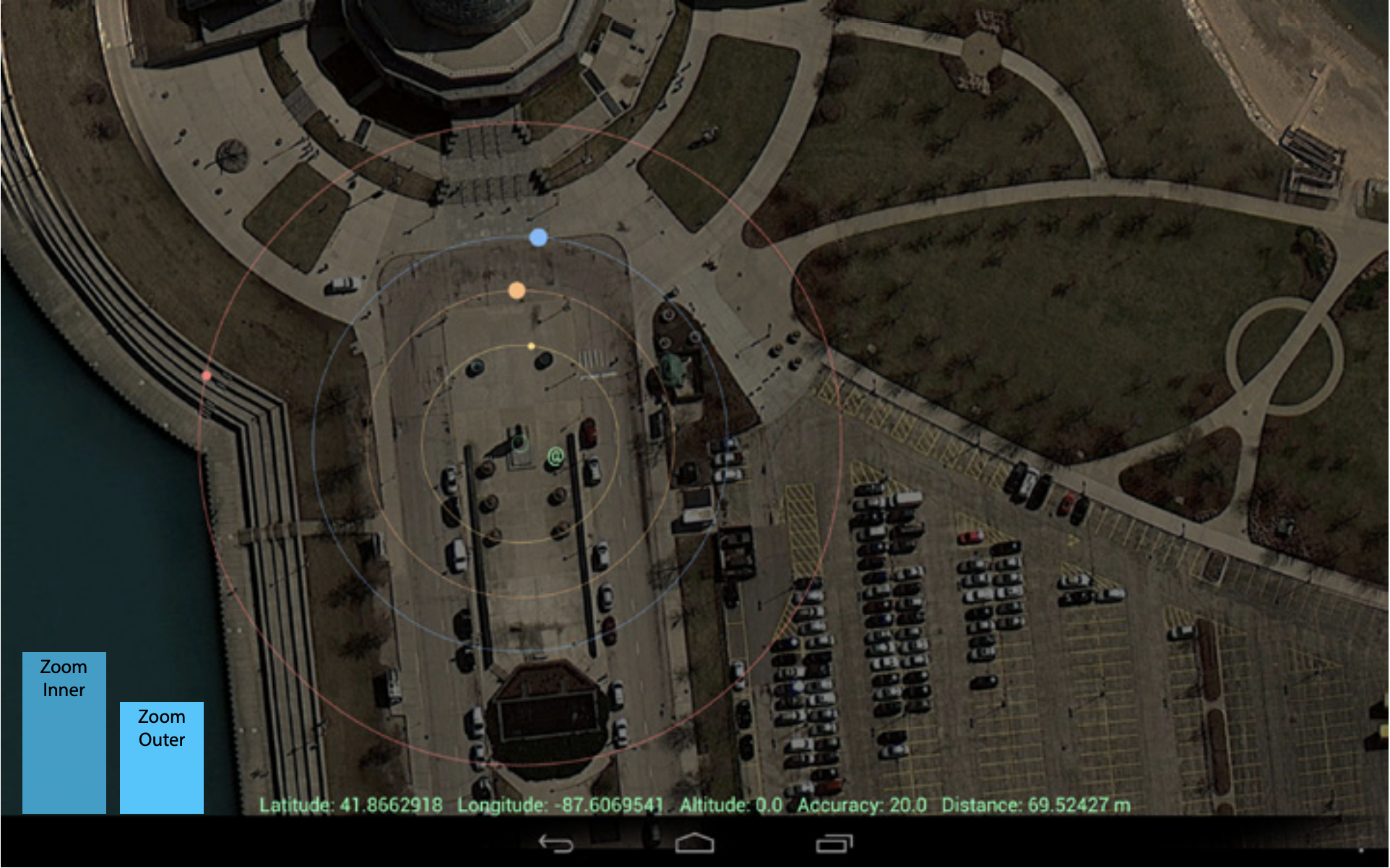
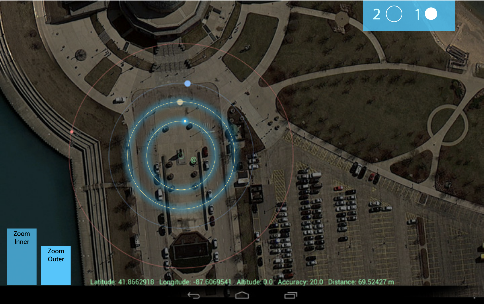
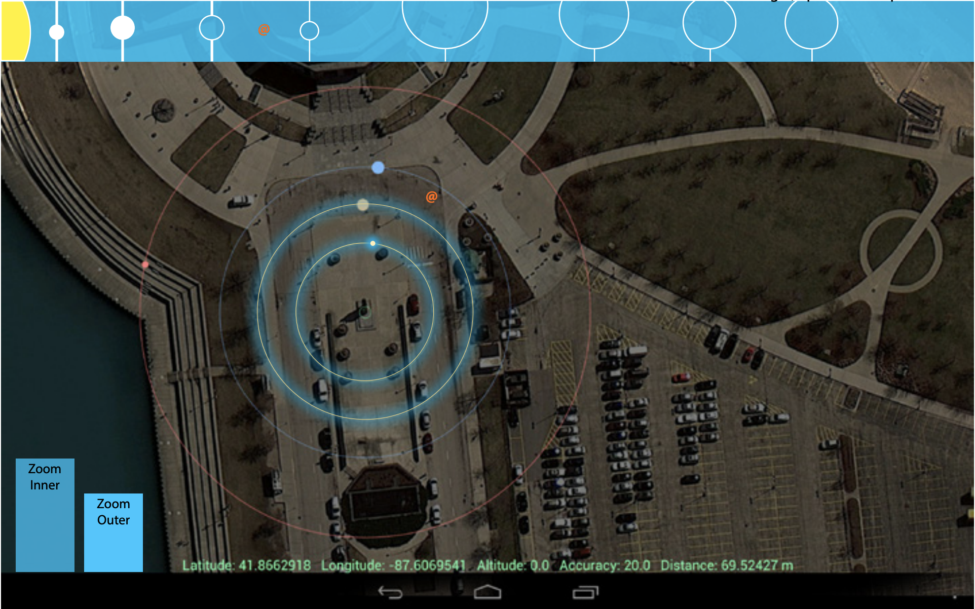
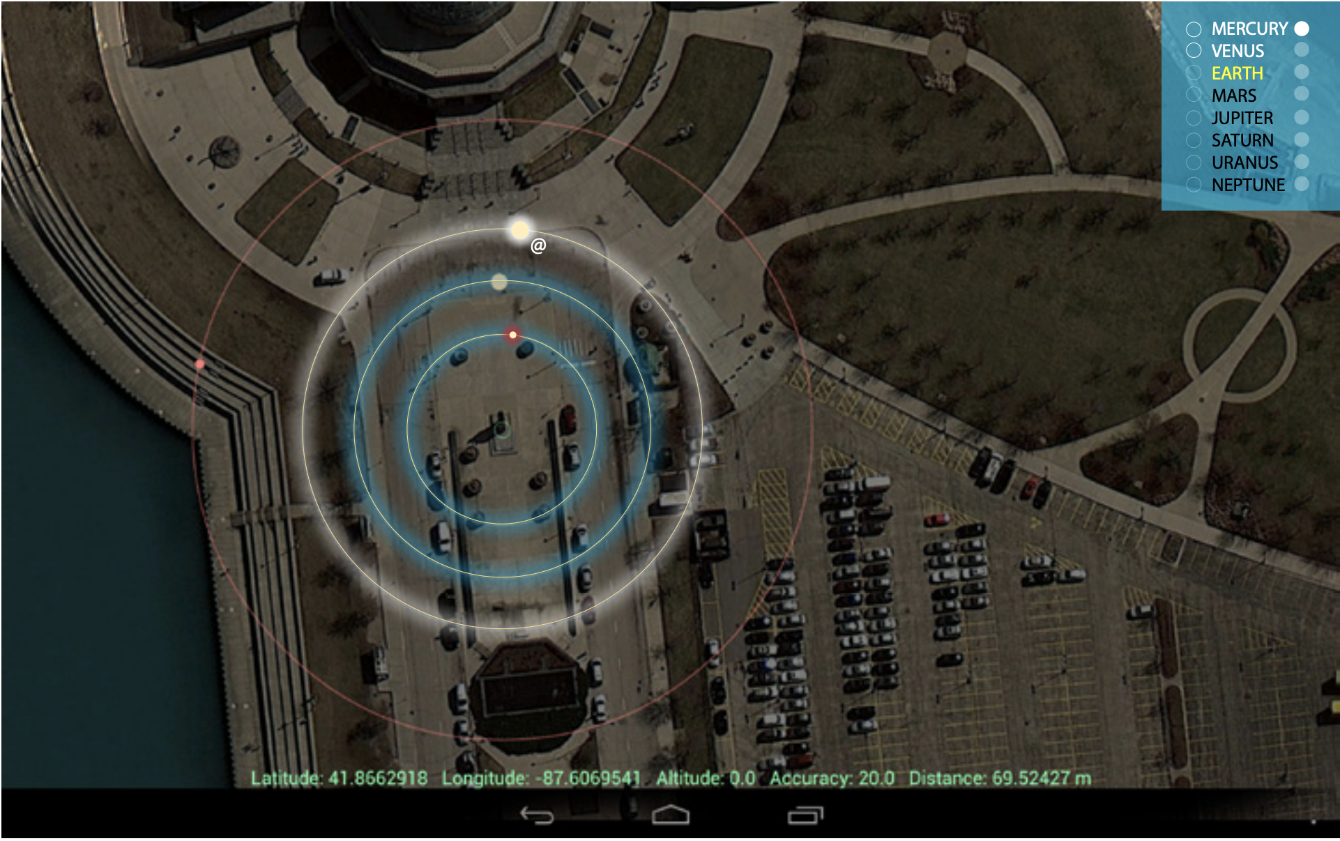
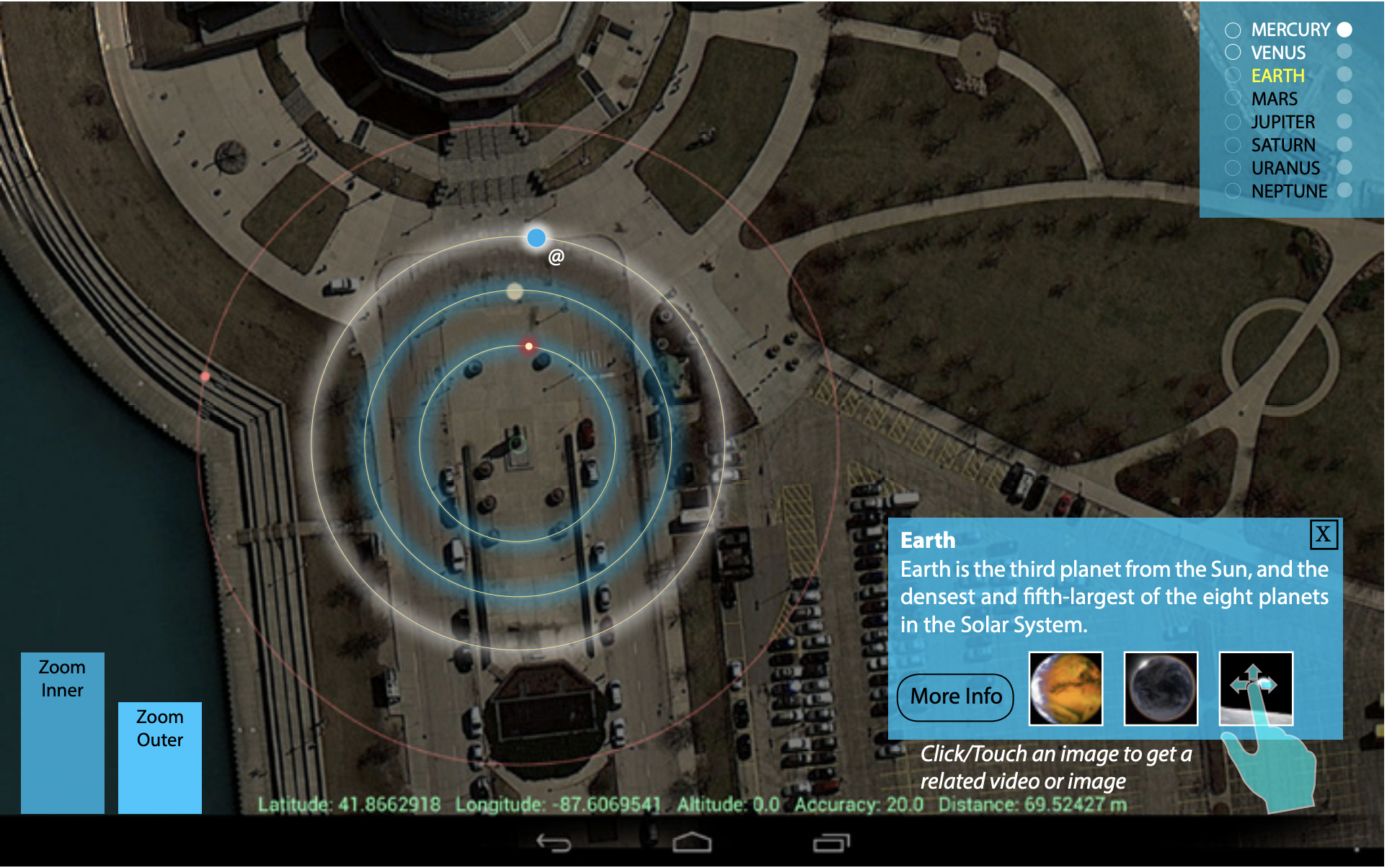
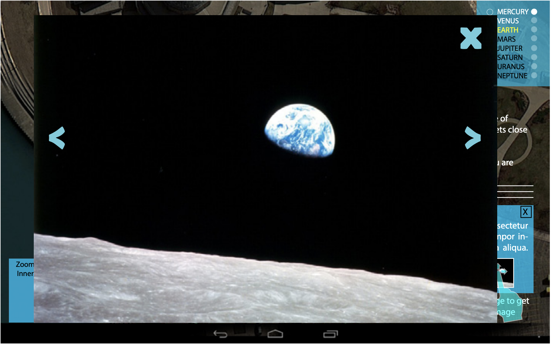
Overhead view with distances displayed
Gude to the galaxy, a volunteer mobile app concept
Role: User Experience Designer/Researcher
Entity: Adler Spatial Visualization Lab
Location: Chicago, IL
Years: [Specify years]
Team make-up: Primary designer, reporting to the Design Lead.
This was a weekend (2 days!) grad school project where I volunteered at the Adler Planetarium’s Spatial Visualization Lab in Chicago.
The goal was to design an android application that recreates the spatial relationship of the Solar System within the scale of the Adler Planetarium and Northly Island park. It provides in-depth and educational information while adding a healthy and fun element, of hiking through the Solar System.
This was purely a design exercise and while I believe there was further work to continue development, design work wasn’t further needed.
Concept designs and the steps taken to reaching them are displayed here.
The challenge
All of the applications and projects at Adler are focused around educating visitors about space, the solar system, and the science and research in that realm. Adler attracts a wide audience of visitors and the challenge here was designing an app that would engage the more energetic students who visited.
Initial steps
Brainstorming – Our primary stakeholders were a mixture of the current full-time workers at Adler who would carry on our design work and the visitors who would be using it. There was a general goal of creating some sort of educational mobile android app that would both be fairly easy to create but also drew on the mobile benefits an app brings.
Technical explorations – There was a big requirement of making sure this would be a buildable concept. Myself and other grad student exploring this were both adept with code so alongside brainstorming around broad ideas, we both looked into the technical feasibility of various ideas. Knowing what we COULD produce in code influenced how far we stretched ideas.


Initial conversations and interviews of visitors
Interviewing for ideas
Physical interactions – Moving, scanning, stamping, or connecting with a physical object, these ideas were all discussed and thrown around. Most of the displays in the museum were static and there was a core idea to make this one interactive and physical in nature.
Connection to the real world – The planetarium lived on a larger island/park that was often ignore as students came and went. There was discussion around how the app could connect to the larger urban landscape around the museum.
Incentives to continue – The average visitor, while it included parents, tourists and hobbyists, was a student. Providing incentives to draw these users forward became a requirement.
Core ideas: Modes
To cater to the wide audience (students, parents, researchers) the final idea of having
“Levels of information” was settled on.
Easy – Basic information, catering to younger students.
Medium - More in depth, but still not super scientific targeting parents and tourists.
Hard - Very deep info, that even visiting researchers would find interesting.
Discovery Mode – You just cross the orbits, no definite destination for the users.
Geocache Mode – The planets are in set locations, you have to get to them specifically.
Story/Trivia Mode – A longer route, based upon a storyline or answering quiz questions, leading you from planet to planet, at specific locations.
Technical restrictions
There were a few technical restrictions found in the initial studies:
The GPS/Location did not update as consistently as desired.
The screen had issues within sunlight due to shading.
Different Android Devices would require optimization due to size.
These had some straight forward design fixes:
Generalize the design so specific GPS coordinates wasn’t as important.
Using minimal, simple shapes so that visuals wouldn’t be affected as much by light.
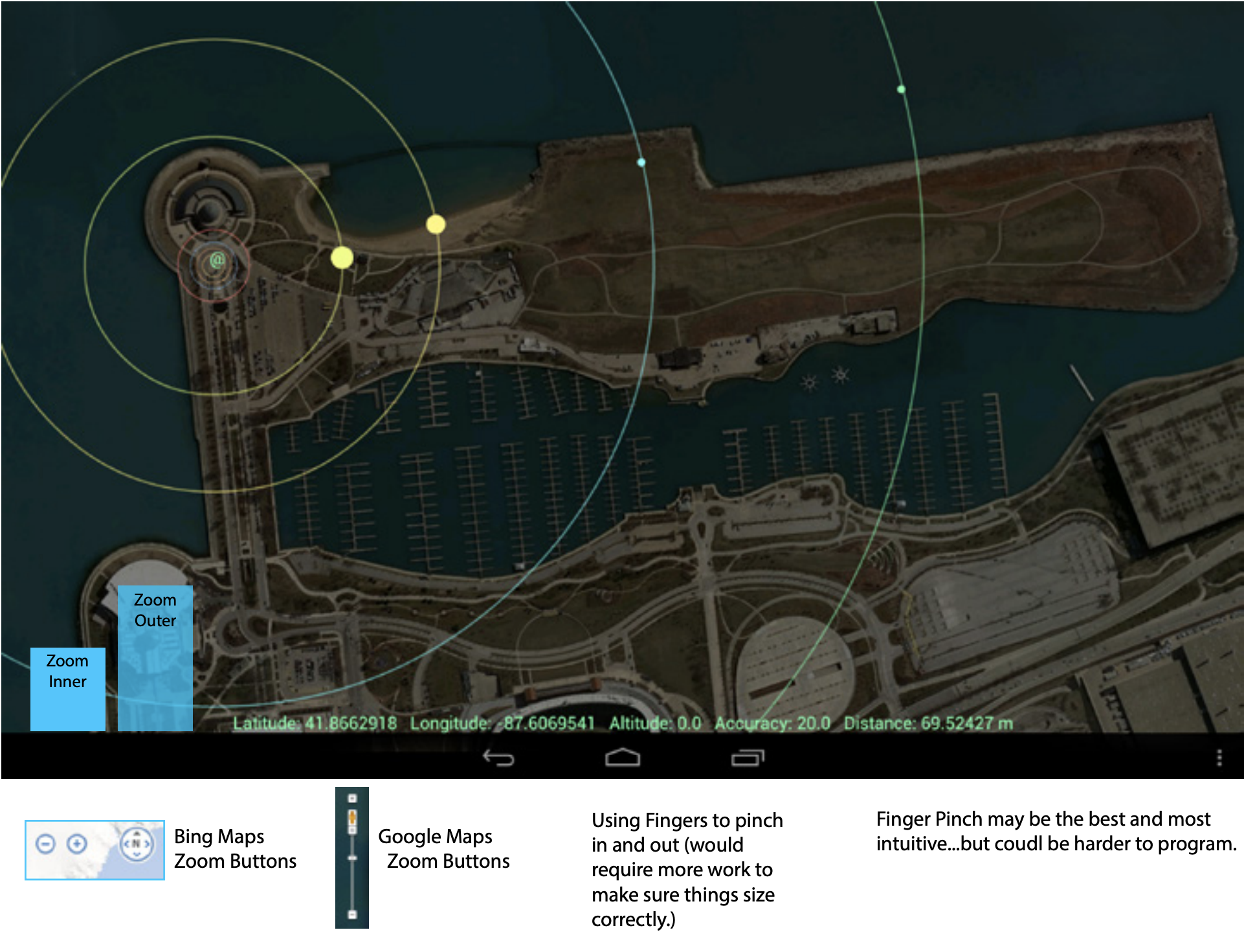
Provide both a responsive and zoomable design so that sizing could change based on user needs.
Screens and example final visuals
This was an older grad school project. There was a period of sketching/early visuals but those have been lost to time.
Below you will see screen shots pointing out specific points of interest in the final mock-ups.
Conclusions
The research and design findings along with the concepts were passed onto Adler with the beginnings of the Android app we’d created. Visuals were going to be further refined but the base concept was successfully laid out.